HERE’S ALL YOU NEED TO KNOW ABOUT USING AND APPLYING THE IAME SERIES BRAND
IAME SERIES GUIDELINE
The strength of our Brand relies on the consistent and appropriate use of thee Brand Assets – Logos, colors, typeface and others. While there are very limited instances where the use of the IAME Series Brand Assets is permitted, we are publishing the Brand Guidelines to assist you with the proper use of the Brand Assets in the exceptional cases. If you have any doubt, please reach out to us at info@iamekarting.com.
The logo is our most visible and recognizable symbol. It is always present on all our communications across digital and printed media.
The IAME Series logo is our official brand symbol around the world and should not be used off the guidelines described in this document.
If the logo of your Country seems not to be available, please contact us and we will realize it soon. Please consult the marketing team if you are unsure on how to use the logo or any of the element in the brand palette.
CLEAR SPACE
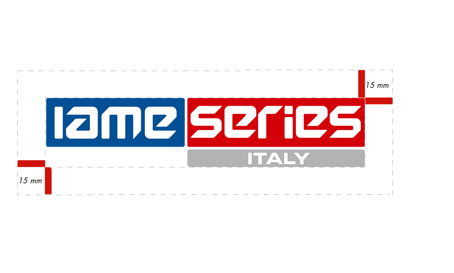
Our logo needs to be visible in each of its applications.
To ensure this is always achieved, a minimum amount of “clear space” surrounding the logo is clearly identified. The clear space is determined in 15mm (0,59 inches).
This space should always be free from graphics or text. It is acceptable and encouraged to give our logo more clear space than the prescribed 15mm (0,59 inches), should the space allow to.
SQUARE LOGO PLACEMENT
When containing IAME Series’ logo inside a square, it should always be placed in the centre and scaled up until the left/right clearspace will be equal.

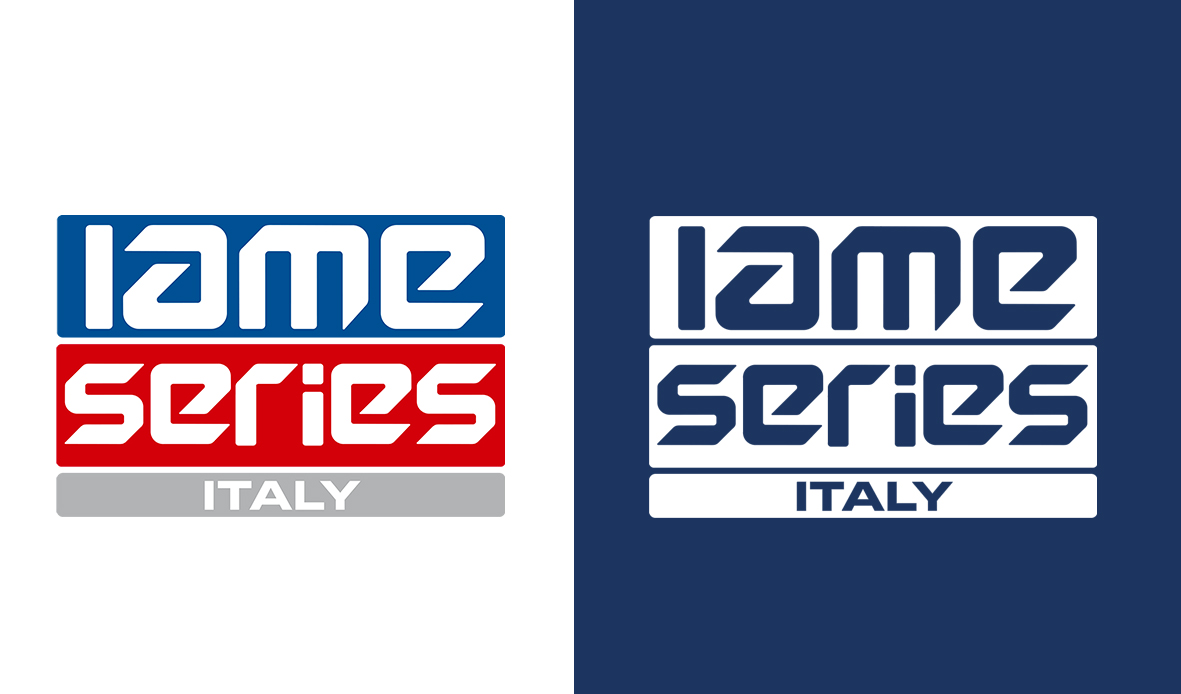
VERTICAL VERSION
The vertical version is more compact and visible. It can be used on any document, following the same rules of margins and colors used for the classic logo.
LOGO COLOR
Wherever possible please use the primary positive or negative logo.
When it is not possible to use the primary logos in our institutional color, please use black and white version.
Do not use our logo in different colors.
PRIMARY POSITIVE LOGO
Blue: c100 m85 y35 k25
For use on light backgrounds.
PRIMARY NEGATIVE LOGO
White
For use on our blue background

SECONDARY POSITIVE LOGO
Black
For use on light background
SECONDARY NEGATIVE LOGO
White
For use on colored backgrounds.
THE ABOVE SHOWS HOW OUR CORE COLOUR PALETTE SHOULD BE USED, AND HOW MUCH OF EACH COLOUR TO USE IN ANY DESIGN
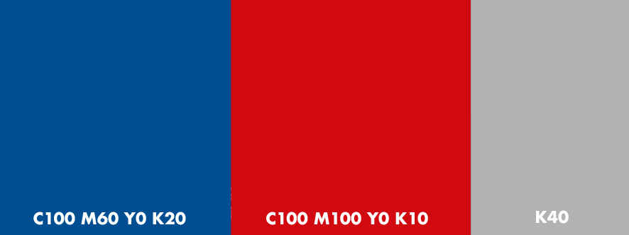
PRIMARY COLOUR PALETTE
The primary colour palette consists of our core brand colours.
Our primary blue will be always our unique choice for the logo (except for the negative form).
You can use the other colours to give a blue tonality to the pictures for your visuals.
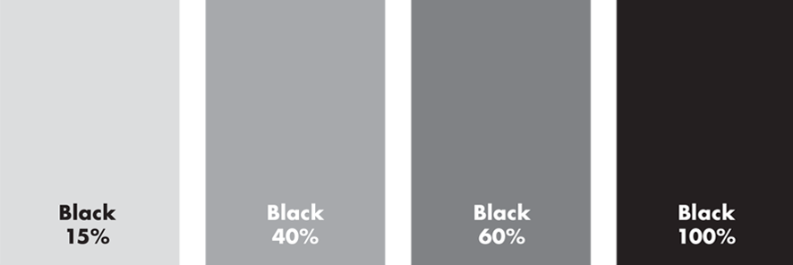
SECONDARY COLOUR PALETTE
The secondary colour palette offers a selection of grey gradients.
These colours should only be used only if the primary colours will not be visible. With dark backgrounds you should always use the logo in negative form (white)
An integral part of the IAME Brand is the typography we use to communicate with our customers. Our typeface reinforces the consistency of our Brand. It provides enhanced readability and represents quality, simplicity, ease of use for which IAME is known.
Primary fonts: Futura
This typeface has been selected for its clean appearance, strong legibility and impact, and it should be used across all communications. Futura was chosen for its variety and flexibility. It is used in its ‘black’ weight for:
headlines: regular for subheads and for body copy (When Futura is unavailable please use system font Arial).
You can use Arial in BOLD or REGULAR weights. Use BOLD for headlines and REGULAR for body copy.
Primary fonts: Eurostile LT
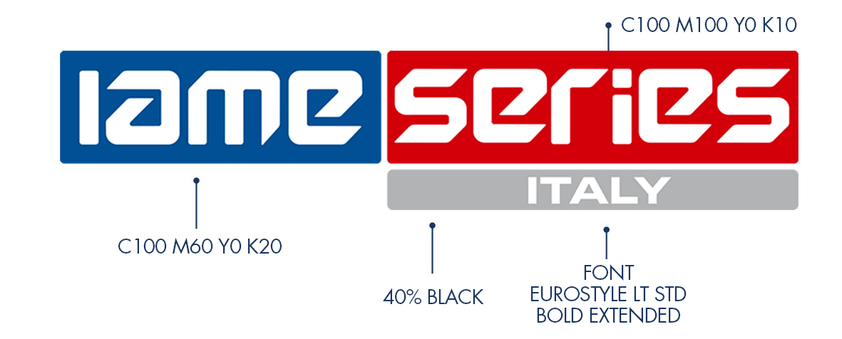
The font used in the logo IAME Series for the name of the country is Eurostile LT, please do not use any other similar fonts.
